This week, we are kicking off a new series that will be complimentary to our Emerging Voices series. Titled Emerging Leaders, this interview series will feature educators, mentors and industry leaders who are investing their time and resources into guiding the next generation of designers. Read the Interview Here >
Let’s Cut the Bullshit—Here’s What it Really Means to Diversify Your Workplace. Surface-level tactics won’t cut it.
“To Douglas Davis, co-chair of AIGA’s Diversity and Inclusion Task Force, the idea of inclusivity is rooted in “belonging.” “There’s a designer who might need a wheelchair, or someone who is deaf or hard of hearing, and that designer is coming to this profession and asking ‘Do I belong?’” says Davis. People in leadership positions should ask their team if they feel like they belong, and if they do, then the organization can conclude that it’s a relevant company (time and time again, it’s been proven that diverse organizations are better equipped to serve customers and minimize bias, thus making them relevant). “Employees have to be sober enough to look at the truth,” says Davis. “If people are leaving an organization in droves, it’s because it’s tone deaf at some level.” Assessing itself through the lenses of “belonging” and “relevance” helps organizations stay accountable to those they’re hiring; a sense of “belonging” naturally builds trust and productiveness. But of course, belonging can be relative.” Read the article >
Design Experts Weigh In on DDB’s and Joan’s New Visual Identities Beauty remains firmly in the eye of the beholder By Lindsay Rittenhouse, Doug Zanger 3/29/19
AGENCIES DDB and Joan Creative (now just Joan) recently unveiled new visual identities for their 70th and third anniversaries, respectively.
We asked design experts in the industry to weigh in on both: like, love or just OK?
These are their unapologetically blunt takes:
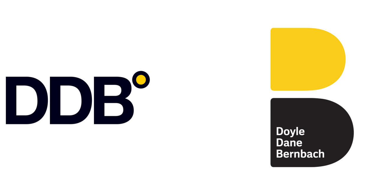
DDB’s new logo pays homage to founders Ned Doyle, Mac Dane and Bill Bernbach, incorporating their names into the fresh visual which is essentially a revamped version of its very first one—two Ds, one yellow and one black, stacked on top of one another.
Old Logo
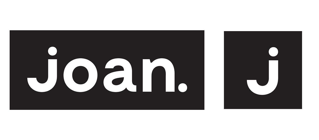
Joan’s new identity, which coincides with the agency opening its new office at 44 Wall Street in late 2018, drops the “Creative” in its name and reimagines the lowercase, rounded typeface logo as an “impactful, edgier, uppercase word mark” with the “J” designed to represent Joan of Arc’s sword, CEO Lisa Clunie recently told Adweek.
Douglas Davis, Chair, BFA in Communication Design at New York City College of Technology
DDB: Loved it. “As a designer who broke into advertising, I remember walking into DDB’s offices on Madison Avenue wondering why the place looked like we were accountants. These were the days when an agency’s creative personality didn’t reach its own identity, interior design or website. So, I’m glad to see this design build on Bernbach’s respect for what a concept looked like. Then again, respect for visual problem solving makes sense when you’re partnered with Paul Rand. The perspective that combined the visual alongside the verbal changed advertising and is still influencing how we see the Ds make the B. That’s why the new logo is successful, it requires the viewer to see both the parts and the whole. It’s candy.”
Joan: It was OK. “I’m not a fan of Joan’s new look, but typographically speaking, they took risks I can respect. It’s risky in my view because it sacrifices the legibility of the J in exchange for the dagger application. And yet it’s better than the typeface they had, which felt too much like Jet, their client’s logo. All in all, typefaces go in and out of fashion, so this choice feels good for being noticed. Turned my head.”
Chris Do, president and founder of The Futur
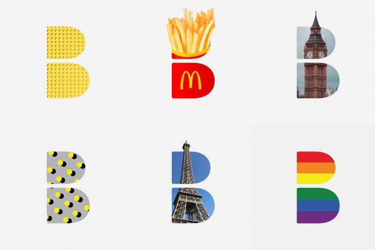
DDB: Liked it. “I think the rebrand is clever, bold and appropriate. It has a slightly nostalgic vibe to it but I think this was intentional to also reference the founders. I can see the mark being used in many ways where the previous mark couldn’t. It can be used as a graphic container, bug and repeating pattern.”
Joan: Didn’t like it. “I think there is something much more interesting about the simplicity to the original mark. It feels modern, quirky, friendly, personal, unpretentious. The new word mark feels over-designed and trying too hard to be symbolic.”
George Garrastegui, Jr., assistant professor/creative catalyst for NYC College of Technology
DDB: Liked it. “It is a clever form of the two Ds making up the counter of the larger B—similar in concept to the original logo, but it is in the application that it shines. Great fun is had within the shapes and the weight of the bottom black D grounds the logo. Overall the success of the mark relies too much on its application for me, but the nod to its historic beginning is a refreshing bet on themselves and not the competition.”
Joan: Loved it. “When I noticed the Joan Creative logo, it struck me as a fresh take on a brand. In comparison to its older version, it looks to move in the right direction. The previous logo, even though fun, it’s too similar to the jet brand. The update does away with the kitsch and takes a stab at achieving a memorable agency mark. This young brand now feels more mature and the usage of high contrast letterforms and a typewriter serif works harmoniously. This combination has a playful and modern twist that fits the style of work Joan focuses on.”
This Design Life and the UK Creative Community ask Douglas and 22 others How Important is Design in 2019?
By Chris Green
With all the “design it yourself” websites and cheap design services popping up, we asked 23 top designers to share their thoughts on how essential design is right now. Here’s what they said >
Steven Heller talks to Douglas Davis about Imported From Brooklyn
By Steven Heller
Veteran master letterer Tony Di Spigna has an exhibition, “Imported From Brooklyn,” now on view at The Grace Gallery organized by the Communication Design Department, New York City College of Technology, where he will be donating his archive to City Tech and it will become the department’s first permanent collection. I spoke to Douglas Davis, Associate Professor who conceived of the exhibit (curated by Sara Woolley-Gomez) about Di Spigna’s significance to lettering history and for today’s student. Read more here>


